Hi, I'm now a fairly long time user of Geany. I have been using the SVN for some time, and update it regularly.
I've built up a couple of suggestions over time, and thought I'd mail them on this group.
1. Project Manager
One of the recent features I have noticed is the new project manager. It's nice, but I think there is something missing, I will try to elaborate...
Now prior to using Geany, I was a Windows user and used an editor called Crimson Editor. Crimson Editor also had a project manager, but it had something more. If you started or opened a project, you had a "Project" tab on the left (at the moment Geany only has a Symbols and Open Files tab here). Under the project tab, you could add files that belong to your project, or add groups (folders). Double clicking on one of these items, would open that file. This was very handy when managing large projects with quite a few files.
The project files themselves were just saved as XML. Another handy feature (which as I recall was turned on by default), is that it would open the last project every time you opened Crimson Editor, including any open files, it would associate the open files with the project too, so also save this information inside the project file. Opening a project meant it would open any files you had open last time you where working with this project.
IF you want to see this behaviour, I suggest downloading Crimson Editor (windows only), and having a play with the project manager.
At the moment, the only purpose I see with projects in Geany, is the ability to have a custom run command, a description and set a base path, but it doesn't appear to do much more than that (at first glance anyway). It would be really nice, to possibly see a project manager, similar to Crimson Editor in the future.
This would have to be my number one feature I would love to see in Geany.
2. Inner Classes
The next thing is to do with Inner Classes and the Symbols tab on the left dock. I use the Geany a lot with the Django web framework recently, it's really handy because of the integrated terminal! Anyway, Django (being Python based) uses inner classes a bit (a class within a class). You usually end up having to repeat the "Admin" or "Meta" inner class inside several other classes, because this is how Django works. Here's an example:
class Model1(models.Model): field = models.CharField(maxlength=128)
class Admin: pass
class Model2(models.Model): field2 = models.CharField(maxlength=128)
class Admin: pass
The problem with this, is I get multiple "Admin" items in my Symbol tab on the left in Geany. It's not a real problem or anything, but it could maybe be improved. Maybe, having Admin show as a sub item of each base class would be a bit better.
3. UI wishes
The other two things I was going to mention are merely cosmetic, since I am quite a user interface freak/Tango fan :) But I don't actually see these as important at all.
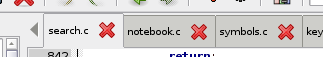
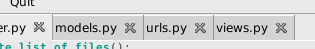
First one is, the icon on the close button on tabs doesn't seem very nice. Compare this for example with GEdit, or pretty much any other GTK application, they seem to use the icon from the current icon theme on the close button. If I change between Tango and Human icon sets, this changes with it. Geany only appears to be using a black cross at the moment.
Second one, is the new icons added to the Symbols are nice and all, but they don't blend in very well with the rest of my desktop. It would be really nice to see them more Tango-ified.
On Mon, 01 Oct 2007 00:08:24 +1300, Rob van der Linde robvdl@gmail.com wrote:
Hi,
- Project Manager
One of the recent features I have noticed is the new project manager. It's nice, but I think there is something missing, I will try to elaborate...
Now prior to using Geany, I was a Windows user and used an editor called Crimson Editor. Crimson Editor also had a project manager, but it had something more. If you started or opened a project, you had a "Project" tab on the left (at the moment Geany only has a Symbols and Open Files tab here). Under the project tab, you could add files that belong to your project, or add groups (folders). Double clicking on one of these items, would open that file. This was very handy when managing large projects with quite a few files.
The project files themselves were just saved as XML. Another handy feature (which as I recall was turned on by default), is that it would open the last project every time you opened Crimson Editor, including any open files, it would associate the open files with the project too, so also save this information inside the project file. Opening a project meant it would open any files you had open last time you where working with this project.
Well, maybe some of these suggestions will be added sometime. SOme of then are already on the TODO list.
- Inner Classes
[...]
The problem with this, is I get multiple "Admin" items in my Symbol tab on the left in Geany. It's not a real problem or anything, but it could maybe be improved. Maybe, having Admin show as a sub item of each base class would be a bit better.
Well, I don't want to implement this. IMO, the effort to implement this would be much higher than the use of it. It would probably cause heavy changes in the included tagmanager code and needs a lot of work to make the current code working with nested tags.
First one is, the icon on the close button on tabs doesn't seem very nice. Compare this for example with GEdit, or pretty much any other GTK application, they seem to use the icon from the current icon theme on the close button. If I change between Tango and Human icon sets, this changes with it. Geany only appears to be using a black cross at the moment.
We could use a GTK stock icon so the icon would change when changing the global icon theme. But in general these icons are much larger than the current one, so the notebook tabs would become quite larger and people may think of wasting space because of these big icons. The current cross is probably not very nice but it is at least small. Any suggestions are welcome.
Second one, is the new icons added to the Symbols are nice and all, but they don't blend in very well with the rest of my desktop. It would be really nice to see them more Tango-ified.
Yes, it would be nice. But it seems there are no appropriate Tango icons available.
Regards, Enrico
Well, I don't want to implement this. IMO, the effort to implement this would be much higher than the use of it. It would probably cause heavy changes in the included tagmanager code and needs a lot of work to make the current code working with nested tags.
That's ok, I don't use the symbols tab all that much, it would have been nice, but if it's a lot of work, I understand.
We could use a GTK stock icon so the icon would change when changing the global icon theme. But in general these icons are much larger than the current one, so the notebook tabs would become quite larger and people may think of wasting space because of these big icons. The current cross is probably not very nice but it is at least small. Any suggestions are welcome.
I don't actually expect these to be done anyway, they are merely cosmetic and totally unnecessary. I did actually measure the height of tabs in GEdit with stock close icon, height of tabs in Geany with little black cross, and tabs without a close icon, like the Symbols tab on the left dock in Geany.
Both GEdit with stock and Geany with the little black cross were 29 pixels high, and tabs without a close button were 28 pixels high. So it doesn't actually seem to make any difference, although it could maybe on some GTK themes. But it's only cosmetic in the end, so don't worry about it.
Second one, is the new icons added to the Symbols are nice and all, but they don't blend in very well with the rest of my desktop. It would be really nice to see them more Tango-ified.
Yes, it would be nice. But it seems there are no appropriate Tango icons available.
Maybe if I have some spare time one day, and if I feel like it, I will see what I can whip up in Inkscape. If I do, I will post my icons, but don't hold me to that :)
On 30/09/07 18:01:51, Enrico Tröger wrote:
On Mon, 01 Oct 2007 00:08:24 +1300, Rob van der Linde robvdl@gmail.com wrote:
- Inner Classes
[...]
The problem with this, is I get multiple "Admin" items in my Symbol tab on the left in Geany. It's not a real problem or anything, but
it
could maybe be improved. Maybe, having Admin show as a sub item of each base class would be a bit better.
Well, I don't want to implement this. IMO, the effort to implement this would be much higher than the use of it. It would probably cause heavy changes in the included tagmanager code and needs a lot of work to make the current code working with nested tags.
I agree, but I committed a change to show the parent class as a prefix to the inner class name in the symbol list, so you can tell which is which.
[...]
First one is, the icon on the close button on tabs doesn't seem
very
nice. Compare this for example with GEdit, or pretty much any other GTK application, they seem to use the icon from the current icon theme on the close button. If I change between Tango and Human icon sets, this changes with it. Geany only appears to be using a black cross at the moment.
We could use a GTK stock icon so the icon would change when changing the global icon theme. But in general these icons are much larger than the current one, so the notebook tabs would become quite larger and people may think of wasting space because of these big icons. The current cross is probably not very nice but it is at least small. Any suggestions are welcome.
Probably GEdit scales the stock icon down to fit - I'll have to check sometime.
Regards, Nick
On 01/10/07 12:01:43, Nick Treleaven wrote:
On 30/09/07 18:01:51, Enrico Tröger wrote:
On Mon, 01 Oct 2007 00:08:24 +1300, Rob van der Linde robvdl@gmail.com wrote: We could use a GTK stock icon so the icon would change when
changing
the global icon theme. But in general these icons are much larger than the current one, so the notebook tabs would become quite larger and people may think of wasting space because of these big icons. The current cross is probably not very nice but it is at least small. Any suggestions are welcome.
Probably GEdit scales the stock icon down to fit - I'll have to check sometime.
Geany SVN now uses the stock close item for tabs :)
Regards, Nick
On Mon, 01 Oct 2007 12:58:51 +0100, Nick Treleaven nick.treleaven@btinternet.com wrote:
On 01/10/07 12:01:43, Nick Treleaven wrote:
On 30/09/07 18:01:51, Enrico Tröger wrote:
On Mon, 01 Oct 2007 00:08:24 +1300, Rob van der Linde robvdl@gmail.com wrote: We could use a GTK stock icon so the icon would change when
changing
the global icon theme. But in general these icons are much larger than the current one, so the notebook tabs would become quite larger and people may think of wasting space because of these big icons. The current cross is probably not very nice but it is at least small. Any suggestions are welcome.
Probably GEdit scales the stock icon down to fit - I'll have to check sometime.
Geany SVN now uses the stock close item for tabs :)
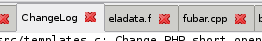
But it doesn't look good ;-(. Attached are two screenshots on my system. close_icon_small.png is taken from current SVN version with the scaled down stock icon. Looks bad because the icon can't be scaled down so much. close_icon_big.png is taken from a version compiled with scaling the icon, using the same icon size as GTK menus item have. This looks better but for me it is too big, the notebook tabs take too much vertical space. This was I was talking about in my last mail.
Regards, Enrico
On 01/10/07 13:28:06, Enrico Tröger wrote:
On Mon, 01 Oct 2007 12:58:51 +0100, Nick Treleaven nick.treleaven@btinternet.com wrote:
Geany SVN now uses the stock close item for tabs :)
But it doesn't look good ;-(. Attached are two screenshots on my system. close_icon_small.png is taken from current SVN version with the scaled down stock icon. Looks bad because the icon can't be scaled down so much. close_icon_big.png is taken from a version compiled with scaling the icon, using the same icon size as GTK menus item have. This looks better but for me it is too big, the notebook tabs take too much vertical space. This was I was talking about in my last mail.
On my system it looked fine, and I tried with several icon themes :-/
Does the attached patch help at all? It's similar to what GEdit (2.14) does, (except the alignment somehow seems to affect the image size).
Regards, Nick
On Mon, 01 Oct 2007 16:31:10 +0100, Nick Treleaven nick.treleaven@btinternet.com wrote:
On 01/10/07 13:28:06, Enrico Tröger wrote:
On Mon, 01 Oct 2007 12:58:51 +0100, Nick Treleaven nick.treleaven@btinternet.com wrote:
Geany SVN now uses the stock close item for tabs :)
But it doesn't look good ;-(. Attached are two screenshots on my system. close_icon_small.png is taken from current SVN version with the scaled down stock icon. Looks bad because the icon can't be scaled down so much. close_icon_big.png is taken from a version compiled with scaling the icon, using the same icon size as GTK menus item have. This looks better but for me it is too big, the notebook tabs take too much vertical space. This was I was talking about in my last mail.
On my system it looked fine, and I tried with several icon themes :-/
Does the attached patch help at all? It's similar to what GEdit
No it doesn't. The size request for the button widget doesn't work, don't know why. But you don't need to get the GTK_ICON_SIZE_MENU setting at all because if you add the image generated from the GTK stock icons in the size GTK_ICON_SIZE_MENU it should be enough. This is what I did in my attempt and the result was shown in close_icon_big.png.
Well, if I'm the only one where this occurrs, I can live with it. But not sure how it looks like on other desktops.
Regards, Enrico
On 10/1/07, Enrico Tröger enrico.troeger@uvena.de wrote:
Well, if I'm the only one where this occurrs, I can live with it. But not sure how it looks like on other desktops.
See attached. This is on Ubuntu. All themes I tried had approximately the same problem.
---John
On 01/10/07 16:47:38, Enrico Tröger wrote:
On Mon, 01 Oct 2007 16:31:10 +0100, Nick Treleaven nick.treleaven@btinternet.com wrote:
On 01/10/07 13:28:06, Enrico Tröger wrote:
On Mon, 01 Oct 2007 12:58:51 +0100, Nick Treleaven nick.treleaven@btinternet.com wrote:
Geany SVN now uses the stock close item for tabs :)
But it doesn't look good ;-(. Attached are two screenshots on my system. close_icon_small.png
is
taken from current SVN version with the scaled down stock icon. Looks bad because the icon can't be scaled down so much. close_icon_big.png is taken from a version compiled with scaling
the
icon, using the same icon size as GTK menus item have. This looks better but for me it is too big, the notebook tabs take too much vertical space. This was I was talking about in my last mail.
On my system it looked fine, and I tried with several icon themes
:-/
Does the attached patch help at all? It's similar to what GEdit
No it doesn't. The size request for the button widget doesn't work, don't know why. But you don't need to get the GTK_ICON_SIZE_MENU setting at all because if you add the image generated from the GTK stock icons in the size GTK_ICON_SIZE_MENU it should be enough. This is what I did in my attempt and the result was shown in close_icon_big.png.
Well, if I'm the only one where this occurrs, I can live with it. But not sure how it looks like on other desktops.
I think we should revert the change, at least for the coming release.
Regards, Nick
On Mon, 01 Oct 2007 17:05:58 +0100, Nick Treleaven nick.treleaven@btinternet.com wrote:
On 01/10/07 16:47:38, Enrico Tröger wrote:
On Mon, 01 Oct 2007 16:31:10 +0100, Nick Treleaven nick.treleaven@btinternet.com wrote:
On 01/10/07 13:28:06, Enrico Tröger wrote:
On Mon, 01 Oct 2007 12:58:51 +0100, Nick Treleaven nick.treleaven@btinternet.com wrote:
Geany SVN now uses the stock close item for tabs :)
But it doesn't look good ;-(. Attached are two screenshots on my system. close_icon_small.png
is
taken from current SVN version with the scaled down stock icon. Looks bad because the icon can't be scaled down so much. close_icon_big.png is taken from a version compiled with scaling
the
icon, using the same icon size as GTK menus item have. This looks better but for me it is too big, the notebook tabs take too much vertical space. This was I was talking about in my last mail.
On my system it looked fine, and I tried with several icon themes
:-/
Does the attached patch help at all? It's similar to what GEdit
No it doesn't. The size request for the button widget doesn't work, don't know why. But you don't need to get the GTK_ICON_SIZE_MENU setting at all because if you add the image generated from the GTK stock icons in the size GTK_ICON_SIZE_MENU it should be enough. This is what I did in my attempt and the result was shown in close_icon_big.png.
Well, if I'm the only one where this occurrs, I can live with it. But not sure how it looks like on other desktops.
I think we should revert the change, at least for the coming release.
Yes, maybe we'll find a good solution later.
Regards, Enrico
Slightly off-topic, but the TabMix Plus extension for Firefox has an option I really like, that is to show the close button only on the active tab. This helps prevent accidently closing a tab while clicking to activate it. So, even if you don't the the way the X's look, at least you could have fewer of them :-)
- Jeff
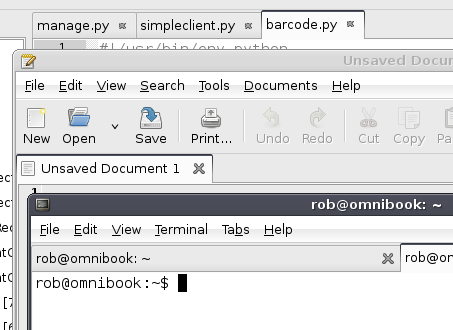
I didn't actually expect aything to be done about the close icons in the end anyway, but have tested it now too, and here are my results. I get the same effect with the small close icons. Attached is a screenshot of Geany, GEdit and Gnome Terminal. The icons in GEdit and Gnome terminal seem identical, but Geany ones are smaller. However tab size remains the same.
On Mon, 2007-10-01 at 11:44 -0500, Jeff Pohlmeyer wrote:
Slightly off-topic, but the TabMix Plus extension for Firefox has an option I really like, that is to show the close button only on the active tab. This helps prevent accidently closing a tab while clicking to activate it. So, even if you don't the the way the X's look, at least you could have fewer of them :-)
The thing with this feature is some people like it, and some people don't. My flatmate uses the Ubuntu Human theme on Firefox (firefox-themes-ubuntu), because it doesn't show the close button on anything but the active tab. I can't stand it, and use the the Ubuntu Tango theme on Firefox myself (also part of firefox-themes-ubuntu), it shows close buttons on all tabs, which is what I want. So thing thing is, I wouldn't want to see it in Geany either, unless it was through a plugin.
On 01/10/07 17:44:35, Jeff Pohlmeyer wrote:
Slightly off-topic, but the TabMix Plus extension for Firefox has an option I really like, that is to show the close button only on the active tab. This helps prevent accidently closing a tab while clicking to activate it. So, even if you don't the the way the X's look, at least you could have fewer of them :-)
You could just hide the tab close buttons and use the toolbar close button. Personally I prefer close buttons for each tab so I can close documents without switching to them first, but for closing the current document the toolbar button is probably easier because it's always in the same place.
Anyway, all this would be much easier if GTK just provided the notebook functionality itself...
Regards, Nick
On 10/2/07, Nick Treleaven nick.treleaven@btinternet.com wrote:
You could just hide the tab close buttons and use the toolbar close button.
But I don't use the toolbar :-)
Personally I prefer close buttons for each tab so I can close documents without switching to them first.
Well, I like having only one button for my web browser, but I might not like it as well in a text editor. At least I stay somewhat focused when I'm coding, but I tend to get a little click-happy when I'm surfing.
Anyway, all this would be much easier if GTK just provided the notebook functionality itself...
Yes, the GTK notebook is still a bit weak in a few spots.
- Jeff
On 02/10/07 12:12:31, Jeff Pohlmeyer wrote:
On 10/2/07, Nick Treleaven nick.treleaven@btinternet.com wrote:
You could just hide the tab close buttons and use the toolbar close
button.
But I don't use the toolbar :-)
Personally I prefer close buttons for each tab so I can close documents without switching to them first.
Well, I like having only one button for my web browser, but I might not like it as well in a text editor. At least I stay somewhat focused when I'm coding, but I tend to get a little click-happy when I'm surfing.
OK, well if you want to write a patch for only the current tab, or to show a close button in the notebook tab area (no idea how that's done ;-)) we would probably apply it.
Regards, Nick
On 01/10/07 16:47:38, Enrico Tröger wrote:
On Mon, 01 Oct 2007 16:31:10 +0100, Nick Treleaven nick.treleaven@btinternet.com wrote:
Does the attached patch help at all? It's similar to what GEdit
No it doesn't.
OK this is my last try on this problem and then I'll give up ;-)
I've made some changes taken from the latest GEdit in setting up the tab close buttons - please test again and report any problems. It should at least fix the clipping of the image, but I don't know whether the buttons are still too big with some themes.
Regards, Nick
On 10/2/07, Nick Treleaven nick.treleaven@btinternet.com wrote:
On 01/10/07 16:47:38, Enrico Tröger wrote:
On Mon, 01 Oct 2007 16:31:10 +0100, Nick Treleaven nick.treleaven@btinternet.com wrote:
Does the attached patch help at all? It's similar to what GEdit
No it doesn't.
OK this is my last try on this problem and then I'll give up ;-)
I've made some changes taken from the latest GEdit in setting up the tab close buttons - please test again and report any problems.
Looks fine here, Nick. [see attached -- note, mouse is over the button on the right to show how it looks highlighted].
---John
Hmm, I hate to be the bearer of bad news here :) Mine's almost fine, but not quite. For some reason my crosses are cropped when I compare them to Gedit by 1 pixel on all 4 sides. If it's possible and not too much effort, maybe grow the image area outwards by 1 pixel on all 4 sides, but not applying any stretching. If it's not possible, that's cool, it's nothing big and it looks close enough as it is now.
Attached is a comparison screenshot anyway.
I can't agree any more about GTK+ tabs needing built in support for this, especially considering so many GTK apps that are bundled with Gnome use them anyway (GEdit, Gnome Terminal are the first that come to mind), then why not include them in GTK itself. You shouldn't have to bother reinventing the wheel in every application you need them and add the close buttons manually.
Also, the patch added the other day that adds the parent class name in front of the sub class name in the symbols browser is great thanks, makes things a little easier to read.
On Tue, 2007-10-02 at 15:49 -0400, John Gabriele wrote:
On 10/2/07, Nick Treleaven nick.treleaven@btinternet.com wrote:
On 01/10/07 16:47:38, Enrico Tröger wrote:
On Mon, 01 Oct 2007 16:31:10 +0100, Nick Treleaven nick.treleaven@btinternet.com wrote:
Does the attached patch help at all? It's similar to what GEdit
No it doesn't.
OK this is my last try on this problem and then I'll give up ;-)
I've made some changes taken from the latest GEdit in setting up the tab close buttons - please test again and report any problems.
Looks fine here, Nick. [see attached -- note, mouse is over the button on the right to show how it looks highlighted].
---John _______________________________________________ Geany mailing list Geany@uvena.de http://uvena.de/cgi-bin/mailman/listinfo/geany
On Wed, 03 Oct 2007 20:52:01 +1300, Rob van der Linde robvdl@gmail.com wrote:
Hmm, I hate to be the bearer of bad news here :) Mine's almost fine, but not quite. For some reason my crosses are cropped when I compare them to Gedit by 1 pixel on all 4 sides.
Same here: Xubuntu Feisty 7.04 / GTK version: 2.10.11-0ubuntu3
-H-
Yeah, I'm using Ubuntu Feisty too, but using Gnome, and I would imagine the same GTK version.
I just noticed that Pidgin also has the close icons cropped by 1 pixel on each side like Geany, but Gedit and Gnome Terminal aren't cropped. I don't think it's all that big of an issue if it can't be fixed anyway.
On Wed, 2007-10-03 at 10:00 +0200, Harold Aling wrote:
On Wed, 03 Oct 2007 20:52:01 +1300, Rob van der Linde robvdl@gmail.com wrote:
Hmm, I hate to be the bearer of bad news here :) Mine's almost fine, but not quite. For some reason my crosses are cropped when I compare them to Gedit by 1 pixel on all 4 sides.
Same here: Xubuntu Feisty 7.04 / GTK version: 2.10.11-0ubuntu3
-H-
Geany mailing list Geany@uvena.de http://uvena.de/cgi-bin/mailman/listinfo/geany
On Wed, 03 Oct 2007 22:27:58 +1300, Rob van der Linde robvdl@gmail.com wrote:
Yeah, I'm using Ubuntu Feisty too, but using Gnome, and I would imagine the same GTK version.
I just noticed that Pidgin also has the close icons cropped by 1 pixel on each side like Geany, but Gedit and Gnome Terminal aren't cropped. I don't think it's all that big of an issue if it can't be fixed anyway.
I'll have a look how Geany draws the buttons in Xubuntu Gutsy 7.10 tonight at home... Gutsy has GTK 2.12, I believe...
-H-
On 03/10/07 08:52:01, Rob van der Linde wrote:
Hmm, I hate to be the bearer of bad news here :) Mine's almost fine, but not quite. For some reason my crosses are cropped when I compare them to Gedit by 1 pixel on all 4 sides. If it's possible and not too much effort, maybe grow the image area outwards by 1 pixel on all 4 sides, but not applying any stretching. If it's not possible, that's cool, it's nothing big and it looks close enough as it is now.
Attached is a comparison screenshot anyway.
OK, thanks. AFAICT, Geany now does the same as the latest GEdit, so there must be a small problem with the GEdit code. I'm not sure about adding manual padding, I'll try to see how other apps do it.
Perhaps it could be due to how the theme engine sets up the button spacing.
I can't agree any more about GTK+ tabs needing built in support for this, especially considering so many GTK apps that are bundled with Gnome use them anyway (GEdit, Gnome Terminal are the first that come to mind), then why not include them in GTK itself. You shouldn't have to bother reinventing the wheel in every application you need them and add the close buttons manually.
And it seems to be surprisingly difficult to get perfect. Well, here's hoping it gets into GTK someday.
Also, the patch added the other day that adds the parent class name in front of the sub class name in the symbols browser is great thanks, makes things a little easier to read.
Great :)
Regards, Nick
On Wed, 03 Oct 2007 12:46:52 +0100, Nick Treleaven nick.treleaven@btinternet.com wrote:
On 03/10/07 08:52:01, Rob van der Linde wrote:
Hmm, I hate to be the bearer of bad news here :) Mine's almost fine, but not quite. For some reason my crosses are cropped when I compare them to Gedit by 1 pixel on all 4 sides. If it's possible and not too much effort, maybe grow the image area outwards by 1 pixel on all 4 sides, but not applying any stretching. If it's not possible, that's cool, it's nothing big and it looks close enough as it is now.
Attached is a comparison screenshot anyway.
OK, thanks. AFAICT, Geany now does the same as the latest GEdit, so there must be a small problem with the GEdit code. I'm not sure about adding manual padding, I'll try to see how other apps do it.
Perhaps it could be due to how the theme engine sets up the button spacing.
Well, I would suggest we still use the fixed close icon or the next release and if anyone wants to improve the current code, do it after the release. I don't care that much about this because IMO it is just not very important which icon is shown but it should be shown clearly and not sandwiched (remember my mail with close_icon_small.png). Btw, it is better now but still looks sandwiched ;-).
Regards, Enrico
On Mon, 01 Oct 2007 12:01:43 +0100, Nick Treleaven nick.treleaven@btinternet.com wrote:
On 30/09/07 18:01:51, Enrico Tröger wrote:
On Mon, 01 Oct 2007 00:08:24 +1300, Rob van der Linde robvdl@gmail.com wrote:
- Inner Classes
[...]
The problem with this, is I get multiple "Admin" items in my Symbol tab on the left in Geany. It's not a real problem or anything, but
it
could maybe be improved. Maybe, having Admin show as a sub item of each base class would be a bit better.
Well, I don't want to implement this. IMO, the effort to implement this would be much higher than the use of it. It would probably cause heavy changes in the included tagmanager code and needs a lot of work to make the current code working with nested tags.
I agree, but I committed a change to show the parent class as a prefix to the inner class name in the symbol list, so you can tell which is which.
This is cool. IMO it is sufficient for now because one can see where the inner class belongs to.
Regards, Enrico
On 10/1/07, Nick Treleaven nick.treleaven@btinternet.com wrote:
On 30/09/07 18:01:51, Enrico Tröger wrote:
On Mon, 01 Oct 2007 00:08:24 +1300, Rob van der Linde robvdl@gmail.com wrote:
- Inner Classes
[...]
The problem with this, is I get multiple "Admin" items in my Symbol tab on the left in Geany. It's not a real problem or anything, but it could maybe be improved. Maybe, having Admin show as a sub item of each base class would be a bit better.
Well, I don't want to implement this. IMO, the effort to implement this would be much higher than the use of it. It would probably cause heavy changes in the included tagmanager code and needs a lot of work to make the current code working with nested tags.
I agree, but I committed a change to show the parent class as a prefix to the inner class name in the symbol list, so you can tell which is which.
Hey, that's neat. Nice work. :)
---John