On Sat, 17 Jan 2009 14:56:11 -0500, "Daniel Richard G." skunk@iSKUNK.ORG wrote:
On Sat, 2009 Jan 17 16:33:11 +0100, Enrico Tröger wrote:
I wrote this in another mail in this thread, one/the reason for the arrow was to simplify the dialog. But based on the feedback in this thread, we will remove it.
Placing a "Replace All" GtkFrame around them might address potential user confusion... grouping the buttons together in the same way that the arrow currently does, but without hiding anything.
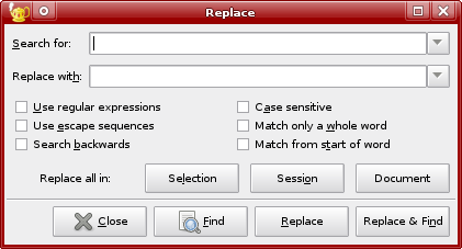
Alternately, just to toss in another idea, NEdit uses a label at the left such that the button labels complete a sentence. Something like
Replace all in: [Session] [Document] [Selection]
Great ideas!
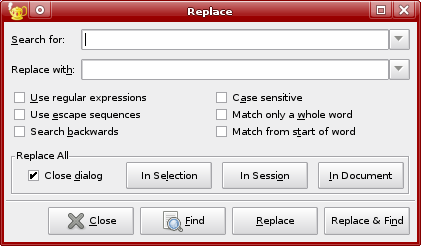
Attached are mockups of both variants together with the necessary code changes (the patches are mainly for reference).
I basically like both variants but would prefer the one with the frame as it groups well the Replace All options together. The variant with the label eliminates the room for the 'Close dialog' checkbox so I commented it out on the screenshot and it looks a bit lost at all, IMO.
Regards, Enrico